General concept
Weavin' Ends Club is London's ultimate events and social group for all those who love to get crafty. Designed for all the young people in London who crave some genuine connections based on their interests, and would like to do something more with their evening than simply going out for the pint. While doing research before the launch, we’ve realised that most of the crochet or knitting groups in the UK focus on the older age group and the meetings are held during usual working hours, which makes it hard for young professionals to join.
My role in the project
Essentially my role was to create the whole visual identity of the brand from scratch. All the visuals and content that is out has been created and curated by me, according to the vision that the other co-founder shared. To fit into our specific niche we had to do a completely different look than standard craft aesthetic, as it helps us in the long run to get the type of audience we want.
Logo
The crucial part of the branding, and the one that always makes me nervous. I never think of myself as a logo designer, but I do try to push myself and explore this path of graphic design to familiarise myself with it. In this case though, I think I absolutely hit the right spot and came up with something that both me and the other founder had in mind when this project first sprouted in our minds. It encapsulates exactly what we want to convey and fits perfectly into all our marketing materials. Whether it is part of the poster, part of a merchandise or just an icon on social media, it carries the vibe of the brand and our ethos.
Posters
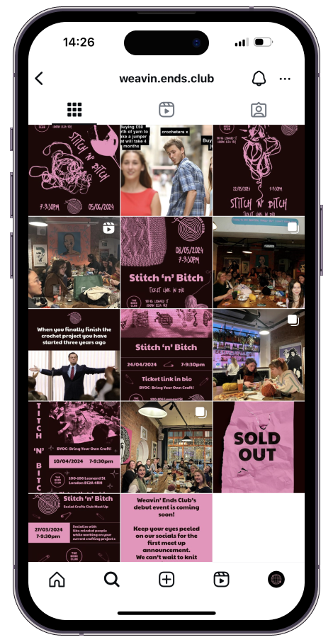
The posters for the events started off with more standard design, using only our primary font. As much as I love experimental art, I felt it might be a bit too much for the beginning, especially when our visual identity was not as established as it is now. I still wanted the poster to look good, but the main goal was to inform and be as clear as possible. Once we felt more confident in our branding and got some positive feedback from the followers, I have started to push boundaries a bit by adding some new fonts and bolder graphics. Thinking about our target audience, we did not want to seem to be only for a particular type of people- we want to be approachable for everyone. The main factor is to keep the balance between feminine and masculine elements, to try and break the traditional concept of crafts, that used to be primarily associated with women.
Social Media
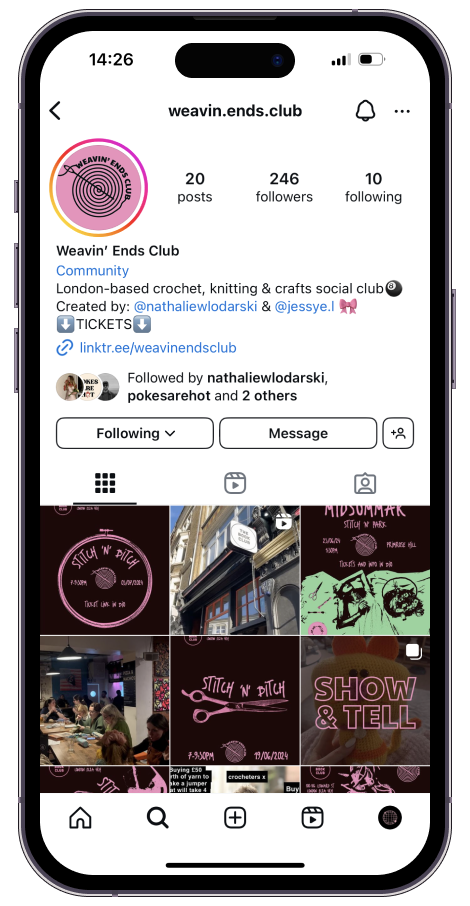
Majority of people find us through social media, so we knew form the beginning that this is going to be the main focus for us. For the start we have decided to post on Instagram and TikTok, and have also created a Facebook page that we want to start promoting later on. Crafty content is getting extremely popular on these platforms, so we thought that for the type of content we are creating it is going to be perfect for us. We can keep the brand consistency as well as give regular updates and connect with our followers. Even though it is still very early stages, it is exciting to be able to start a whole project from scratch and keep getting organic followers.


